
You aren’t a professional designer, but your guests will definitely see if your event isn’t cohesive somewhere along the line. The colors don’t feel like they work together; the items don’t “get” each other. Fortunately, you don’t need a degree in design – nor a lot of money – to make it feel cohesive. You just have to remember a few things, and make one or two decisions early on.
Choose a Strong Anchor
You might have noticed that event design turns into a mess if you try to do too much. This is what any event designer worth their salt is trained to do: build everything around an anchor. Perhaps a color palette, maybe a texture, or simply one well-thought-out element.
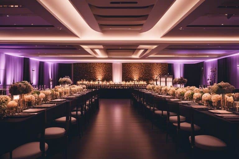
In most events, it’s going to be your tables. Guests spend the most time around them; their use establishes the flow of the event. That’s why the foundational elements are important. While you might just be considering tablecloths and napkins now, it’s about establishing a standard.
The texture of your tablecloth and napkin will make or break this setup. Impressive, well-pressed linens scream that you take this seriously. It’ll kill every element you show up with if they’re weak and poorly presented. Get this right, and everything else will come together – you’ve set your bar.
How to Select a Good Color Palette
Professional events typically stick to three colors in their palettes. More than that in the event space will make it feel like a rainbow and make your guests frayed and overstimulated.
Limiting your palette gives people variety but controls the peace. Color one will be your anchor color; it’ll form 60% of your space (tablecloths). Color number two will make up 30% of your space (napkins). The final color will only make up 10% of your design (smaller decorative elements).
There’s no need to treat this like a hard-and-fast rule. This is to be followed more loosely as an approach – with allowances for your own tastes and design flair. You might not have thought about it before. It messes up color in all manner of random ways.
That rosy blush scheme you thought would be killer when you saw it within the confines of the fabric store? It might turn to chaos in all the right ways under your venue’s natural setup. Get swatches of fabric that you can test under different light conditions before you sign on the dotted line.
How to Mix Textures Like a Pro
Color gets all the attention – often at the expense of thinking through texture. The feel of the material in various compositions does 50% of the heavy lifting for you. It sets up a rhythm for the guests and tells them where to look, what to pay attention to, and what to notice.
Considering mixing textures is scary when you’re not sure what you’re doing here. It gets even scarier when you think about how you’ll mix cotton with satin and then burlap. It’s completely possible to work with those three textures in one composition, but it usually comes out a lot better if it’s done within one décor piece (like a tablecloth) instead of smaller straight décor items.
Stick to a notion of mixing textures as they repeat throughout your area. Focus on tablecloths as a smooth element and centerpieces that are full of texture. When it comes specifically to table settings, consider using specialized and qualified Phoenix linen rentals if you’re nervous about what works with what. A pro doesn’t just mix colors haphazardly; they create combinations that speak to one another because they were designed to fit with one another.
When you get fittings from rental providers, you minimize the guesswork you’d otherwise have to do if you bought from various providers who weren’t trying to see the big picture.
Expect Major Changes with Dramatic Lighting
When it comes to avoiding winging it, consider lighting as one of those factors that require careful thought. Your grand design might be a total mess if you leave it to chance once the guests arrive.
The difference between planning and executing events is natural light. Natural light does strange things to colors.
If you’re executing events over various periods of the day (sunrise to sundown), ensure that you consider how it changes throughout the day. If you’re looking at an all-day event, consider the varying lighting conditions at various times of the day.
Regular fluorescent lighting kills warm colors and creates ugly shadows to leave your décor feeling flat. Incandescent bulbs boost reds and oranges but do nothing for blues and purples. If you consider working with string lights as an extra element for décor or enhancing the ambiance of the space, remember to test them as well.
Candlelight sounds romantic, but it’s flickering rhythm will definitely change how your colors appear. If you want to focus on using perfect crisp white tones throughout your venue, heavy candlelight won’t be in abundance.
Visually Connect Spaces
Connecting your spaces means allowing people to use cues they might not even consciously acknowledge when associating certain elements with their experience. When coordinating your spaces around a design that needs more than one area (cocktail lounge and seating tables), ensure that your spaces tell a story without forcing it to feel like they must be clones of one another.
More often than not, people either make their spaces look exactly the same or they leave no feeling of coherence whatsoever – running the risk of making spaces feel incoherent. Mix repetition with variety.
Ensure that you keep the same palette but adjust it as you apply it in different designs in different areas. For example, the same color can be the mainstay for tablescapes while it can take a backseat as an accent for drinks around the cocktail lounge. You can also think about including something that speaks to all spaces through repetition. Use it in one area as a minor element while keeping it as a key component somewhere else.
For example, maybe incorporate pinks in one area as a major feature, and try to include it somewhere else in the same area while using it as a smaller part of the décor.
Consider Proportions
When it comes to proportions, avoid acting like you’ve never before successfully designed or coordinated an event if you’re not a credible color-usage artist with decades of experience under your belt – colorful awkwardness awaits.
A key rule for coordinating centerpieces is typically avoiding taking up too much space in proportion to what’s actually needed to use the designated areas. Small tables sit at 60inches round and need centerpieces that can fit and work without having to compete with existing decorative elements for working purposes. Ensure that your centerpieces are small and humble (within 12-18 inches) when operating in small-round tables.
Use smaller forms on larger tables when necessary – or expect larger (but unexpected) limitations operating in smaller areas using multiple table arrangements within certain limits.
Get Your Scale Correct
In conjunction with ensuring that everything is proportionate, learn where to use grand installations creatively and appropriately in small areas…and vice versa! Things that work in expansive ballrooms won’t work in intimate venues such as old restaurants.
Avoid decorating spaces seen as useless when busy by finding other decorations in larger area venues. Consider decorated entryways or walls instead.
In smaller areas, think about avoiding taking up too much counter space. Don’t decorate it with multiple small arrangements. Use honest composition instead of messy arrangements looking for something to be proud of.
Comments are closed.